William Bulmer: Craftsman, Typographer, Printer (1757–1830)
Who Was William Bulmer? A Portrait of the Printer from Newcastle
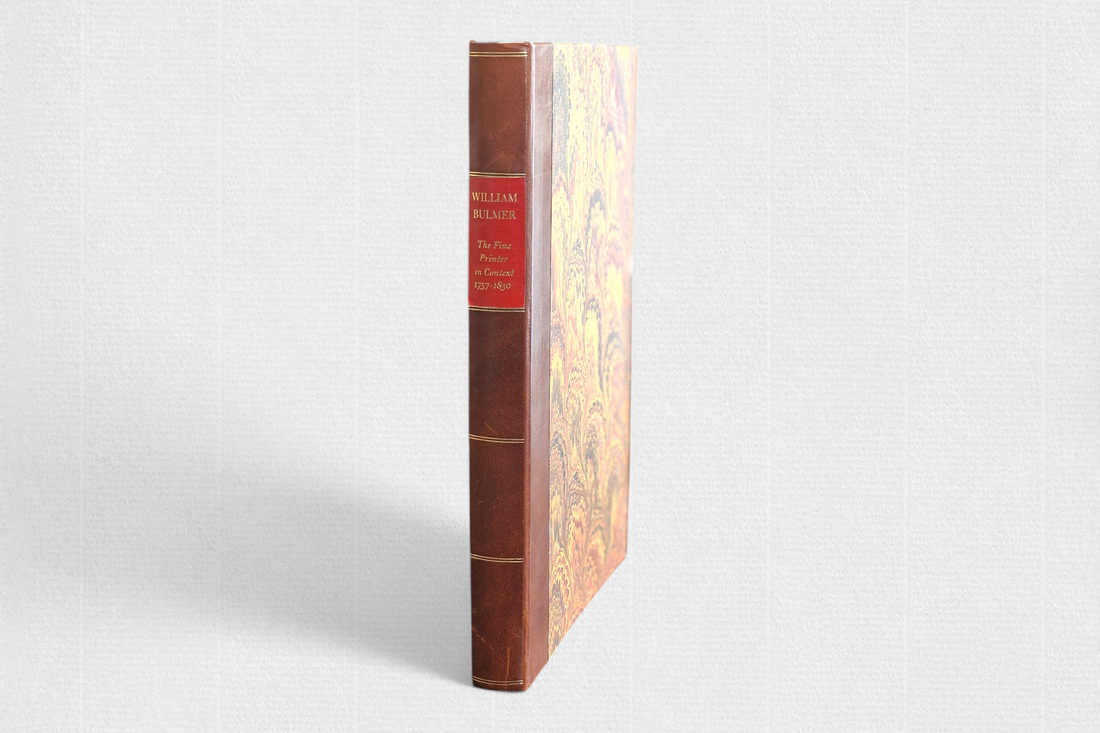
Among the many figures who shaped the development of British printing, William Bulmer holds a distinctive place. His work—both typographically and editorially—set a benchmark for quality at a time when printing was evolving from a craft into a more industrialized process. In our library, we keep a copy of William Bulmer: The Fine Printer in Context 1757–1830 by Peter C. G. Isaac (1993), a well-documented and insightful study that presents Bulmer’s career within its broader historical, cultural, and economic context.
From Newcastle to London: The Start of a Printing Career
Bulmer was born in 1757 in Newcastle upon Tyne. He began his career at a local printshop operated by Thomas Slack, where he gained valuable experience. Soon after, he moved to London—the publishing capital of 18th-century Britain—where he was exposed to the latest printing technologies and the demands of a more discerning market. It was in London that Bulmer founded his own printing house, The Shakespeare Press, which would become one of the most prestigious presses of its era.
The Shakespeare Press and the Boydell Shakespeare Project
Bulmer was not interested in printing cheap editions in large quantities. His aim was to produce books that were refined in every detail. His most famous project was a luxury edition of the works of William Shakespeare, created in collaboration with publisher John Boydell. Known today as The Boydell Shakespeare, this ambitious undertaking took more than a decade to complete (1791–1802) and stood out for its quality printing, careful typesetting, and copperplate illustrations by leading artists of the day.
The Bulmer Typeface: A Collaboration with William Martin
One of the key elements in Bulmer’s success was typography. He worked closely with punchcutter William Martin, who had previously worked with the famed John Baskerville. For Bulmer, Martin designed a new typeface inspired by the fashionable styles of Giambattista Bodoni and Pierre Didot. However, unlike their sometimes stark designs, Martin’s type was more balanced—with a softer contrast between thick and thin strokes and gentler curves. Today known as “Bulmer,” this typeface became one of the most recognizable fonts of the late 18th century and remained influential well into the 19th.
Printing Materials and Execution: Paper, Layout, and Illustrations
The quality of the books published by The Shakespeare Press wasn’t just about type. Bulmer paid close attention to the materials and details. He used specially ordered, high-grade paper—smooth, durable, and well-suited for ink. His books often featured engraved illustrations by notable artists such as Francesco Bartolozzi and Thomas Bewick, which added visual richness to the carefully composed pages.
William Bulmer and the Fine Printing Tradition in Britain
Bulmer’s work is now considered part of what we call the "fine printing" tradition—an approach to publishing that emphasizes quality, aesthetics, and craftsmanship. Unlike early industrial print runs, his editions were made slowly, in limited quantities, and with high attention to detail. They were intended for readers who valued not only the content but also the physical and visual qualities of the book itself.
Bulmer’s Legacy and 19th-Century Influence on British Printing
Bulmer’s influence on the development of printing extended far beyond his death in 1830. Although mass production became the norm in the 19th century, Bulmer’s standards continued to serve as a model for luxury and collector editions. Martin’s typeface was revived and adapted for new technologies, and The Shakespeare Press remained a name associated with excellence for decades.
Peter C. G. Isaac’s Book as a Key Resource
Peter C. G. Isaac’s William Bulmer: The Fine Printer in Context 1757–1830 is one of the few modern publications that comprehensively explores Bulmer’s life and work. Isaac not only documents Bulmer’s typographic achievements but also examines his professional relationships, business strategies, editorial decisions, and cultural relevance. This book is valuable not only for historians of the book and printing but also for typographers, designers, and collectors who want to understand the roots of high-quality publishing.
Conclusion: Why William Bulmer Still Matters
William Bulmer was not a peripheral figure. His work established benchmarks that continued to influence printing long after his time. Thanks to Isaac’s well-researched biography, we can now better understand both the mechanics of Bulmer’s work and the broader context in which it was produced. For anyone interested in the history of typography and bookmaking, Bulmer is a figure well worth exploring—not only for what he printed, but for how he printed it.
