
The Enduring Legacy of the Doves Press: From Early 20th-Century Craft to Modern Digital Revival
Founded around 1900 by Thomas James Cobden-Sanderson and active until early 1917, the Doves Press is considered one of the most important private press initiatives of the 20th century. At a time when fine bookmaking often emphasized elaborate decoration, particularly in the works of William Morris and his Kelmscott Press, Doves Press took a radically different approach. Its books were remarkably restrained: most volumes shared the same format, binding style, and a custom-designed typeface cut specifically for the press. The unique beauty of each edition relied solely on the choice of paper, the purity of the type, and the perfection of the printing.
As Colin Franklin noted in The Private Press (Dufour, 1969), “The paradox is that The Doves Press, with its simplest and cleanest style, was the product of greater passion and careful thought than all the other [British presses] put together.” This simplicity was not a limitation but a deliberate aesthetic philosophy, emphasizing clarity, proportion, and tactile quality over ornate embellishment.
The legend of the Doves Press was further cemented by a dramatic act in its final days. Cobden-Sanderson, the press’s founder, famously threw the distinctive typeface—modeled on 15th-century Venetian types—into the River Thames in late January 1917, submerging twelve-kilogram packages beneath Hammersmith Bridge. This act became one of the most enduring stories in the history of private press printing.
A century later, extensive recovery efforts in the Thames successfully retrieved portions of the type. Using these, Robert Green created a digital revival, Doves Type, which has been commercially available since 2016. This digital typeface allows designers, publishers, and typographers to experience the clarity, elegance, and historical resonance of the original Doves Press types.
At Rambler Press, Doves Type has been employed in the production of Sallust’s The War with Catiline, bringing the classical text together with the distinctive purity and understated beauty of Doves typography. The typeface ensures that every page maintains the balance, proportion, and legibility that characterized the original press.
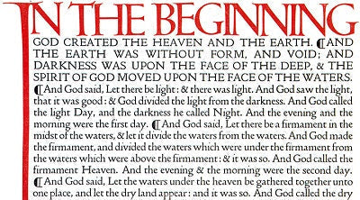
To illustrate the press’s legacy visually, we include a detail from the first page of the Bible, published in five volumes by Doves Press between 1903 and 1905. Today, these volumes are highly valued by collectors, often achieving auction prices of $10,000–$20,000. Their appeal lies not only in rarity but also in meticulous craftsmanship, timeless elegance, and historical significance.
For those fascinated by typographic history, a short BBC film recounts Cobden-Sanderson’s dramatic disposal of the type and the later revival of Doves Type. This story provides an engaging overview of a press whose influence continues to shape typography, fine printing, and the philosophy of book design even a century later.
The Doves Press exemplifies vision, discipline, and enduring artistry. Its commitment to clarity, harmony of type, paper, and printing set a benchmark that continues to inspire modern publishers, typographers, and bibliophiles worldwide. Through the digital revival of Doves Type, the press’s legacy lives on, allowing contemporary readers to engage directly with the aesthetic principles that guided one of the most iconic private presses of the early 20th century.